By Rachel Guise, PPS Editor
A major goal in publishing is to get products into the hands of as many people as possible. This includes making sure final products are accessible to everyone. There are two ways to do this: start with a final product and make it accessible or keep accessibility in mind from the start.
Making Existing Content Accessible
Congratulations on publishing your product! What’s that? You’ve decided to make your content accessible! So, where do you start? For background information, check out PPS’s blog on accessibility.
The first challenge you may come across is the product’s overall appearance. Consider the template you are using. For example, certain color schemes may be hard to look at for those with visual impairments related to color. Fonts, font sizes, and spacing also need to meet certain criteria. Depending on your original product’s look, you might have to start over.
Second, did you include visual aids? Most screen readers can read tables, but charts and images will likely need alt text. Even complex tables may need alt text so that they are easier to follow. PPS has a blog on alt text for more guidelines and suggestions.
A third challenge may be the platform on which you’ve published your product. If your product is a print edition, PPS can help convert it for e-reader accessibility. PPS has a blog on ePUB conversions, too!
Making Content Accessible by Design
Starting over from scratch might not be necessary. Here are some ways to make your product accessible from start to finish.
Create an accessible design from the start. Doing so can avoid later challenges of how to design certain elements to stand out from your normal content. For example, boxes and tables should be set off from regular text but not be too extravagant. Usually, a font change or color change is enough to differentiate the visual aid from regular text.
By tying accessibility into the initial design, you will know from the start that any visual aids will need alt text, and how each image will add to—or take away from—the reader’s experience. Large tables may be hard to follow with screen readers. Opting to present this information in text form may be easier to understand and retain.
Designing your print products to be compatible with online platforms can help in that you may not need to create a second, simpler design for online use. This will also help you figure out how to handle data in terms of a table or running text.
Complex vs Simple Designs
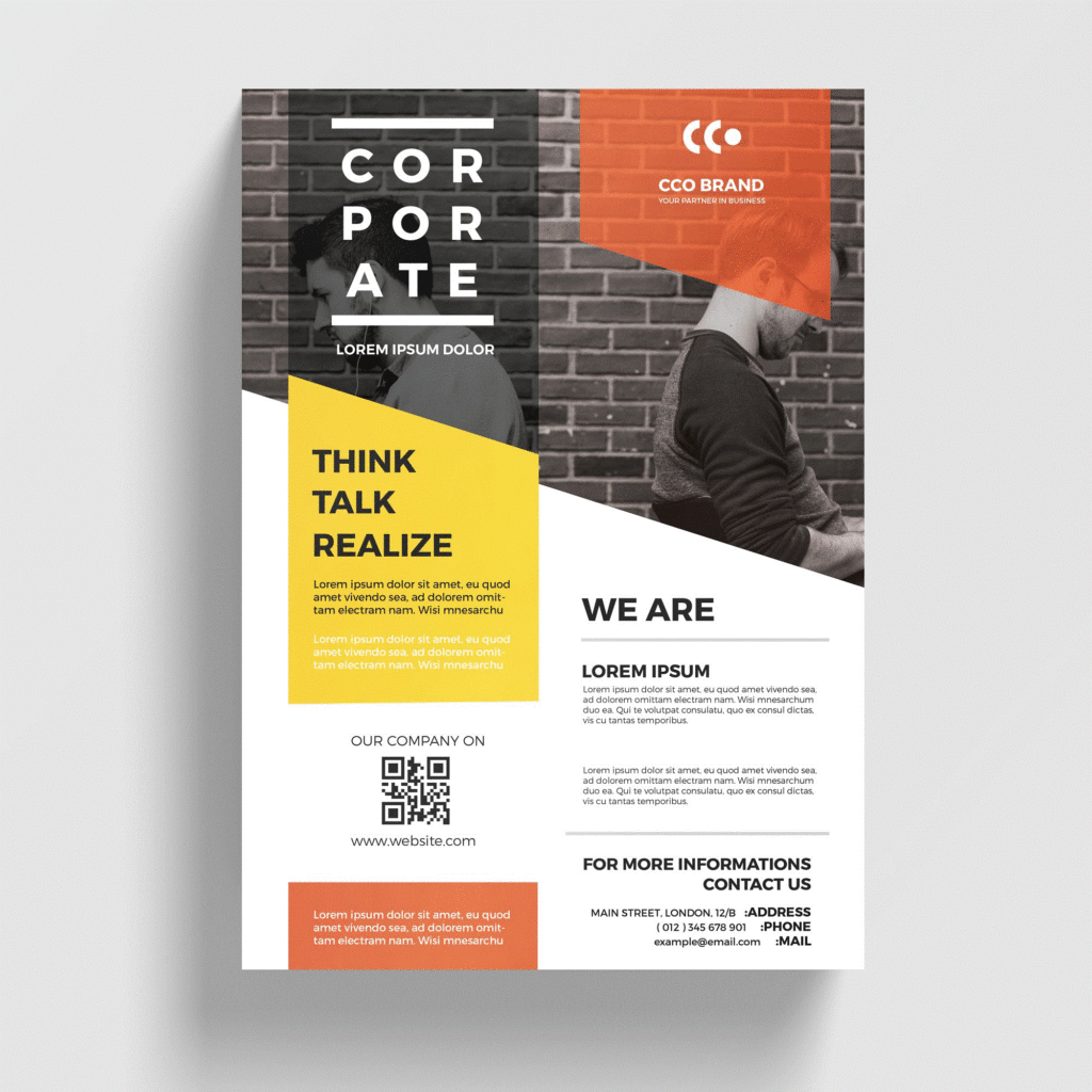
Here is an example of a complex design that may have issues for accessibility. For example, the text box for “corporate” is translucent gray over a black-and-white photograph that contains a pattern. There is also white text over the yellow color pane, which may be difficult to see. A third potential issue is the placement of the various parts. Screen readers tend to read top to bottom, left to right. These parts may not be easy to follow in the order the creator intended.
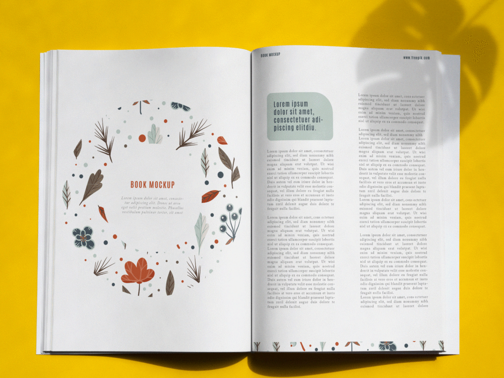
This design is much simpler. A screen reader will most likely be able to read the text on the left page, followed by the alt text for the image. The right page contains only one element, and the rest is text.
Making your product accessible is possible in either way! Whether you want to make a labor of love accessible or create with accessibility in mind, PPS is here for you!